SVG Templates
SVG templates define the visual layout of your screens. They use Tera templating syntax to insert data from your Lua scripts.
Template Basics
A Byonk SVG template is a standard SVG file with Tera expressions:
<svg xmlns="http://www.w3.org/2000/svg" viewBox="0 0 800 480" width="800" height="480">
  <rect width="800" height="480" fill="white"/>

  <text x="400" y="240" text-anchor="middle" font-size="24">
    {{ message }}
  </text>
</svg>
Key points:
- Set
viewBoxto0 0 800 480for TRMNL OG (or0 0 1872 1404for TRMNL X) - Always include
widthandheightattributes - Use
{{ variable }}to insert values from Lua
Display Dimensions
| Device | Width | Height | Aspect Ratio |
|---|---|---|---|
| TRMNL OG | 800 | 480 | 5:3 |
| TRMNL X | 1872 | 1404 | 4:3 |
Byonk automatically scales your SVG to fit the display, but matching the aspect ratio gives the best results.
Variables
Template Namespaces
Variables in templates are organized into four namespaces:
| Namespace | Source | Example |
|---|---|---|
data.* | Lua script return value | data.title, data.items |
device.* | Device info (battery, signal) | device.battery_voltage, device.rssi |
params.* | Config params from config.yaml | params.station, params.limit |
layout.* | Pre-computed layout values | layout.width, layout.grey_count |
Device Variables
These are automatically available under device.*:
| Variable | Type | Description |
|---|---|---|
device.mac | string | Device MAC address (e.g., “AC:15:18:D4:7B:E2”) |
device.battery_voltage | float or nil | Battery voltage (e.g., 4.12) |
device.rssi | integer or nil | WiFi signal strength in dBm (e.g., -65) |
device.model | string or nil | Device model (“og” or “x”) |
device.firmware_version | string or nil | Firmware version string |
device.width | integer or nil | Display width in pixels (800 or 1872) |
device.height | integer or nil | Display height in pixels (480 or 1404) |
<!-- Display battery and signal in header -->
<text class="status" x="780" y="25" text-anchor="end">
  {% if device.battery_voltage %}{{ device.battery_voltage | round(precision=2) }}V{% endif %}
  {% if device.rssi %} · {{ device.rssi }}dBm{% endif %}
</text>

<!-- Responsive layout based on device dimensions -->
{% if device.width == 1872 %}
  <!-- TRMNL X layout (1872x1404) -->
{% else %}
  <!-- TRMNL OG layout (800x480) -->
{% endif %}
Note: Some device variables may be
nilif the device doesn’t report them. Always use{% if device.variable %}to check before using.
Layout Variables
Pre-computed layout values are available under layout.*. These mirror the layout table available in Lua scripts:
| Variable | Type | Description |
|---|---|---|
layout.width | integer | Display width in pixels (default 800) |
layout.height | integer | Display height in pixels (default 480) |
layout.scale | float | Scale factor relative to 800×480 base |
layout.center_x | integer | Horizontal center (width / 2) |
layout.center_y | integer | Vertical center (height / 2) |
layout.margin | integer | Standard margin (20px × scale) |
layout.margin_sm | integer | Small margin (10px × scale) |
layout.margin_lg | integer | Large margin (40px × scale) |
layout.colors | array | Display color palette (hex strings) |
layout.color_count | integer | Number of colors in palette (default 4) |
layout.grey_count | integer | Number of grey levels in palette (default 4) |
This is useful for conditional logic in SVG templates without needing Lua to pass the values through — for example, the components/hinting.svg include uses layout.grey_count to switch between mono and smooth font hinting.
Basic Interpolation
<text>{{ data.title }}</text>
<text>{{ data.user.name }}</text>
<text>{{ data.items[0].label }}</text>
Filters
Apply filters to modify values:
<!-- Truncate long text -->
<text>{{ data.description | truncate(length=50) }}</text>

<!-- Format timestamp (uses UTC) -->
<text>{{ data.updated_at | format_time(format="%H:%M") }}</text>

<!-- Get length -->
<text>{{ data.items | length }} items</text>
Tip: The
format_timetemplate filter uses UTC timezone. For local time formatting, usetime_format()in your Lua script and pass the pre-formatted string to the template.
Default Values
<text>{{ data.title | default(value="Untitled") }}</text>
Control Flow
Conditionals
{% if data.error %}
  <text fill="red">Error: {{ data.error }}</text>
{% else %}
  <text>All systems operational</text>
{% endif %}
Comparisons
{% if data.count > 0 %}
  <text>{{ data.count }} items</text>
{% elif data.count == 0 %}
  <text>No items</text>
{% endif %}

{% if data.status == "active" %}
  <circle fill="green" r="10"/>
{% endif %}
Boolean Checks
{% if data.is_online %}
  <text fill="green">Online</text>
{% endif %}

{% if not data.items %}
  <text>No data available</text>
{% endif %}
Loops
Basic Loop
{% for item in data.items %}
  <text y="{{ 100 + loop.index0 * 30 }}">{{ item.name }}</text>
{% endfor %}
Loop Variables
| Variable | Description |
|---|---|
loop.index | Current iteration (1-indexed) |
loop.index0 | Current iteration (0-indexed) |
loop.first | True on first iteration |
loop.last | True on last iteration |
Positioning with Loops
{% for dep in data.departures %}
  <!-- Calculate Y position based on index -->
  <text y="{{ 80 + loop.index0 * 40 }}">
    {{ dep.time }} - {{ dep.destination }}
  </text>
{% endfor %}
Conditional Styling in Loops
{% for item in data.items %}
  <!-- Alternating row backgrounds -->
  {% if loop.index0 is odd %}
    <rect y="{{ 100 + loop.index0 * 40 }}" width="800" height="40" fill="#f5f5f5"/>
  {% endif %}

  <text y="{{ 125 + loop.index0 * 40 }}">{{ item.name }}</text>
{% endfor %}
Empty State
{% if data.items | length > 0 %}
  {% for item in data.items %}
    <text>{{ item.name }}</text>
  {% endfor %}
{% else %}
  <text fill="#999">No items found</text>
{% endif %}
Styling
Inline Styles
<text x="20" y="40"
      font-family="sans-serif"
      font-size="24"
      font-weight="bold"
      fill="black">
  {{ data.title }}
</text>
CSS in Style Block
<svg xmlns="http://www.w3.org/2000/svg" viewBox="0 0 800 480">
  <style>
    .title { font-family: sans-serif; font-size: 32px; font-weight: bold; }
    .subtitle { font-family: sans-serif; font-size: 18px; fill: #666; }
    .highlight { fill: #333; font-weight: bold; }
  </style>

  <text class="title" x="20" y="40">{{ data.title }}</text>
  <text class="subtitle" x="20" y="70">{{ data.subtitle }}</text>
</svg>
Variable Fonts
Byonk supports variable fonts via CSS font-variation-settings:
<style>
  .light { font-family: Outfit; font-variation-settings: "wght" 300; }
  .regular { font-family: Outfit; font-variation-settings: "wght" 400; }
  .bold { font-family: Outfit; font-variation-settings: "wght" 700; }
</style>
Note: Place custom font files (e.g.,
Outfit-Variable.ttf) in thefonts/directory.
Colors and Palettes
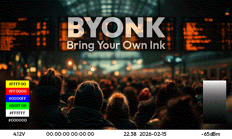
E-ink displays support a limited color palette. The default 4-grey OG palette is #000000, #555555, #AAAAAA, #FFFFFF, but color displays may have palettes like #000000, #FFFFFF, #FF0000, #FFFF00. The display palette is available in Lua via layout.colors.
The palette follows a priority chain: Lua script colors return > device config colors > firmware Colors header > system default. You can override the palette per-device in config.yaml:
devices:
  "ABCDE-FGHJK":
    screen: transit
    colors: "#000000,#FFFFFF,#FF0000"
Or per-script by returning colors in the Lua result table (see Lua API: colors).
Dithering Mode
Byonk supports two dithering modes via the dither option:
graphics(default) — Blue noise ordered dithering, best for UI contentphoto— Atkinson error diffusion, best for photographs
Set per-device in config.yaml or per-script in the Lua return table (see Lua API: dither and Content Pipeline: Rendering Intents).
Using Palette Colors
For the cleanest output, use colors from the display palette directly. Byonk will dither any color to the nearest palette color, but exact palette matches are preserved without dithering.
-- In your Lua script
local colors = layout.colors  -- e.g., {"#000000", "#555555", "#AAAAAA", "#FFFFFF"}
<!-- Use palette colors for crisp rendering -->
{% for swatch in data.swatches %}
<rect x="{{ swatch.x }}" width="{{ swatch.width }}" height="100" fill="{{ swatch.color }}"/>
{% endfor %}
Testing Display Colors
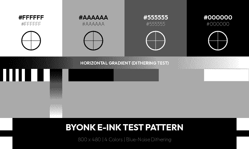
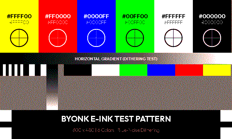
The included graytest screen adapts to the device palette and shows all available colors as swatches with gradient and dithering tests.
4-grey palette (TRMNL OG default):
6-color palette (color e-ink display):
The default screen also adapts to the palette:
Avoid
- Gradients - Convert to dithered patterns (may look noisy)
- Subtle color differences - May become indistinguishable on limited palettes
- Colors not in palette - Will be dithered to nearest match
Font Rendering for E-ink
Byonk uses a patched version of resvg for SVG rendering, which adds font hinting support with custom CSS properties for fine-tuning. Getting these right makes a big difference on e-ink displays, where there are few (or no) gray levels to smooth out font edges.
Available Properties
| Property | Values | Default | Description |
|---|---|---|---|
-resvg-hinting-target | smooth, mono | smooth | mono for 1-bit displays, smooth for displays with gray levels |
-resvg-hinting-mode | normal, light, lcd, vertical-lcd | normal | Hinting strength. normal = strongest grid-fitting, light = softer |
-resvg-hinting-engine | auto-fallback, auto, native | auto-fallback | auto uses FreeType’s auto-hinter (more consistent), native uses the font’s built-in hints |
-resvg-hinting-symmetric | true, false | true | Symmetric rasterization. false can improve consistency at small sizes |
-resvg-hinting-preserve-linear-metrics | true, false | false | true forces uniform glyph spacing |
shape-rendering | auto, crispEdges, geometricPrecision | auto | crispEdges disables anti-aliasing on shapes and lines |
text-rendering | auto, optimizeSpeed, optimizeLegibility, geometricPrecision | auto | Hint for text rendering quality |
Recommended Presets
1-bit display (black & white only):
text {
  -resvg-hinting-target: mono;
  -resvg-hinting-mode: normal;
  -resvg-hinting-engine: auto;
  -resvg-hinting-symmetric: false;
  -resvg-hinting-preserve-linear-metrics: true;
  shape-rendering: crispEdges;
}
4 gray levels:
text {
  -resvg-hinting-target: smooth;
  -resvg-hinting-mode: normal;
  -resvg-hinting-engine: auto;
  shape-rendering: crispEdges;
}
16 gray levels:
text {
  -resvg-hinting-target: smooth;
  -resvg-hinting-mode: light;
  -resvg-hinting-engine: auto;
}
Adaptive Hinting
The components/hinting.svg include automatically applies the right hinting settings based on the display’s grey levels:
<style>
  text {
    {% include "components/hinting.svg" %}
  }
</style>
On black-and-white displays (grey_count <= 2) it enables mono hinting with crispEdges; on displays with more grey levels it uses smooth hinting. All built-in screens use this component.
Hinting Demo Screen
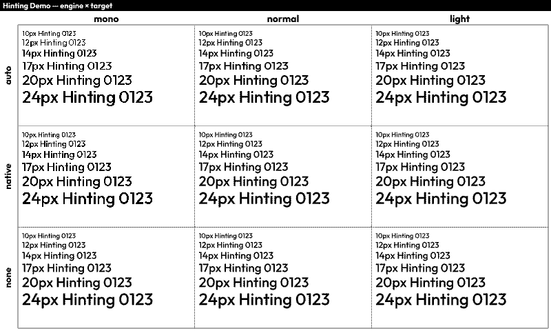
The built-in hintdemo screen provides a visual comparison of all hinting engine and target combinations in a 3×3 grid:
- Columns: mono, normal (smooth), light (smooth)
- Rows: auto engine, native engine, no hinting
Enable it in your config.yaml to see how different settings affect text rendering at various font sizes on your actual display.
Tips
- Use the
autoengine. The FreeType auto-hinter applies a consistent algorithm to all glyphs. Native font hints vary in quality and can produce inconsistent letterforms (e.g., the same letter rendering differently at the same size). - Choose font sizes that land on whole pixel boundaries. Fractional pixel heights cause glyphs to snap to the grid differently, producing inconsistent shapes.
shape-rendering: crispEdgeseliminates anti-aliased edges on lines and rectangles — important when there are few gray levels to work with.- Test on your actual display. Optimal settings depend on the font, font size, and display capabilities. The presets above are starting points.
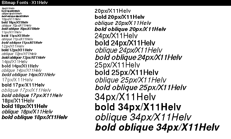
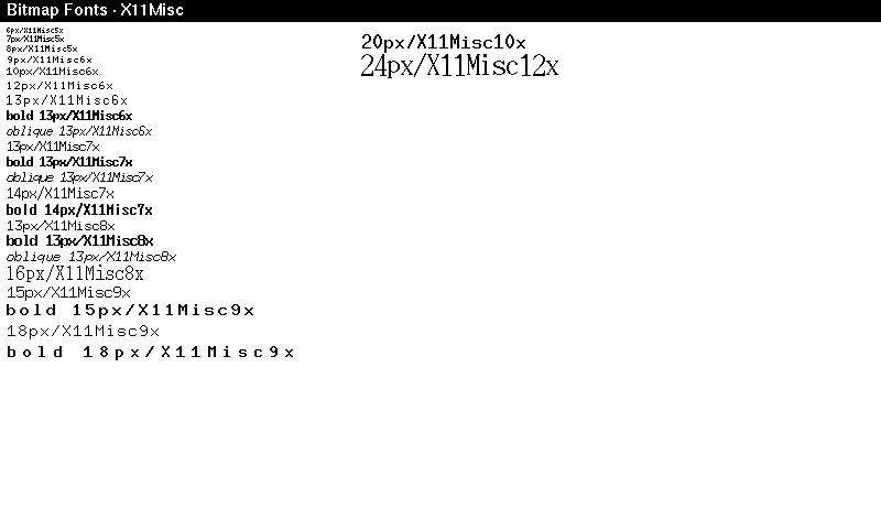
Bitmap Fonts
Byonk ships with X11 bitmap fonts converted to TTF files. These contain embedded bitmap strikes — pre-rendered glyphs at specific pixel sizes — which produce perfectly crisp text on e-ink displays without any hinting artifacts.
Available Families
Proportional fonts:
| Family | Styles | Pixel Sizes |
|---|---|---|
| X11Helv | Regular, Bold, Oblique, BoldOblique | 8, 10, 11, 12, 14, 17, 18, 20, 24, 25, 34 |
| X11LuSans | Regular, Bold, Oblique, BoldOblique | 8–34 (13 sizes) |
| X11LuType | Regular, Bold | 8–34 (13 sizes) |
| X11Term | Regular, Bold | 14, 18 |
Fixed-width fonts (grouped by cell width):
| Family | Styles | Pixel Sizes |
|---|---|---|
| X11Misc5x | Regular | 6, 7, 8 |
| X11Misc6x | Regular, Bold, Oblique | 9, 10, 12, 13 |
| X11Misc7x | Regular, Bold, Oblique | 13, 14 |
| X11Misc8x | Regular, Bold, Oblique | 13, 16 |
| X11Misc9x | Regular, Bold | 15, 18 |
| X11Misc10x | Regular | 20 |
| X11Misc12x | Regular | 24 |
Usage
Set font-family to the family name and font-size to a pixel size that matches a bitmap strike. The renderer automatically selects the closest strike:
<text font-family="X11Helv" font-size="14">Proportional text</text>
<text font-family="X11Helv" font-size="14" font-weight="700">Bold</text>
<text font-family="X11Misc7x" font-size="13">Fixed width</text>
<text font-family="X11Misc7x" font-size="13" font-style="oblique">Fixed oblique</text>
For sizes without an exact bitmap strike, autotraced scalable outlines are used as fallback — but these won’t look as clean as the native bitmap sizes.
Bitmap Font Demo Screen
The built-in fontdemo-bitmap screen showcases all sizes and styles for a given font family. Configure it with the font_prefix parameter:
screens:
  fontdemo-bitmap:
    params:
      font_prefix: X11Helv   # or X11LuSans, X11LuType, X11Term, X11Misc
This renders each available size and style combination as a labeled line, useful for picking the right font and size for your screen.
Layout Patterns
Header + Content
<svg xmlns="http://www.w3.org/2000/svg" viewBox="0 0 800 480">
  <!-- Header bar -->
  <rect width="800" height="70" fill="black"/>
  <text x="30" y="48" fill="white" font-size="28">{{ data.title }}</text>
  <text x="770" y="48" fill="#aaa" font-size="14" text-anchor="end">{{ data.time }}</text>

  <!-- Content area -->
  <g transform="translate(0, 70)">
    <!-- Your content here, Y coordinates start at 0 -->
  </g>
</svg>
Grid Layout
{% for item in data.items %}
  {% set col = loop.index0 % 3 %}
  {% set row = loop.index0 // 3 %}

  <rect x="{{ col * 266 }}" y="{{ 80 + row * 100 }}"
        width="260" height="90" fill="#f0f0f0" rx="5"/>
  <text x="{{ col * 266 + 130 }}" y="{{ 130 + row * 100 }}"
        text-anchor="middle">{{ item.name }}</text>
{% endfor %}
Two Columns
<!-- Left column -->
<text x="30" y="100">Left content</text>

<!-- Divider -->
<line x1="400" y1="80" x2="400" y2="450" stroke="#ccc"/>

<!-- Right column -->
<text x="430" y="100">Right content</text>
Dynamic Styling
Conditional Colors
{% for item in data.items %}
  <text fill="{% if item.is_urgent %}red{% else %}black{% endif %}">
    {{ item.name }}
  </text>
{% endfor %}
Dynamic Classes
<text class="{% if data.count > 100 %}highlight{% else %}normal{% endif %}">
  {{ data.count }}
</text>
Status Indicators
{% if data.status == "online" %}
  <circle cx="20" cy="20" r="8" fill="green"/>
{% elif data.status == "warning" %}
  <circle cx="20" cy="20" r="8" fill="orange"/>
{% else %}
  <circle cx="20" cy="20" r="8" fill="red"/>
{% endif %}
Common Patterns
Truncating Long Text
<text>
  {% if data.title | length > 30 %}
    {{ data.title | truncate(length=30) }}
  {% else %}
    {{ data.title }}
  {% endif %}
</text>
Formatted Numbers
Use Lua to format numbers before passing to template:
-- In Lua script
return {
  data = {
    temperature = string.format("%.1f°C", temp),
    price = string.format("$%.2f", amount)
  }
}
Time-Based Styling
-- In Lua script
local hour = tonumber(time_format(time_now(), "%H"))
return {
  data = {
    is_night = hour < 6 or hour > 20
  }
}
<rect width="800" height="480" fill="{% if is_night %}#333{% else %}white{% endif %}"/>
Debugging Templates
Show Raw Data
<!-- Temporarily add this to see all data -->
<text x="10" y="460" font-size="10" fill="#999">
  Debug: {{ data.items | length }} items
</text>
Check for Missing Data
{% if not data.title %}
  <text fill="red">ERROR: title is missing!</text>
{% endif %}
Template Errors
If your template has a syntax error, Byonk will display an error screen with the message. Check the server logs for details.
Embedding Images
Byonk supports embedding images in your SVG templates. You can include PNG, JPEG, GIF, WebP, and SVG files.
Asset Directory Structure
Place your screen assets in a subdirectory matching your screen name:
screens/
├── hello.lua         # Script at top level
├── hello.svg         # Template at top level
└── hello/            # Assets for "hello" screen
    ├── logo.png
    ├── icon.svg
    └── background.jpg
Method 1: Direct in SVG (Automatic Resolution)
Simply reference images by filename in your SVG template. Byonk automatically resolves relative paths to the screen’s asset directory and embeds them as data URIs:
<svg xmlns="http://www.w3.org/2000/svg" viewBox="0 0 800 480">
  <!-- This automatically loads screens/hello/logo.png -->
  <image x="10" y="10" width="64" height="64" href="logo.png"/>

  <text x="100" y="50">{{ data.greeting }}</text>
</svg>
Supported image formats:
- PNG (
.png) - JPEG (
.jpg,.jpeg) - GIF (
.gif) - WebP (
.webp) - SVG (
.svg)
Notes:
- Paths are relative to the screen’s asset directory
- URLs starting with
data:,http://, orhttps://are left unchanged - Missing images log a warning but don’t break rendering
Method 2: Via Lua (For Dynamic Images)
For more control, use read_asset() and base64_encode() in your Lua script:
screens/hello.lua:
local icon = read_asset("icon.png")

return {
    data = {
        greeting = "Hello World!",
        icon_src = "data:image/png;base64," .. base64_encode(icon)
    },
    refresh_rate = 3600
}
screens/hello.svg:
<svg xmlns="http://www.w3.org/2000/svg" viewBox="0 0 800 480">
  <image x="10" y="10" width="64" height="64" href="{{ data.icon_src }}"/>
  <text x="100" y="50">{{ data.greeting }}</text>
</svg>
This method is useful when you need to:
- Conditionally include images
- Fetch images from external URLs
- Process or transform image data
Background Images
To use a full-screen background image:
<svg xmlns="http://www.w3.org/2000/svg" viewBox="0 0 800 480" width="800" height="480">
  <!-- Background image -->
  <image x="0" y="0" width="800" height="480" href="background.png" preserveAspectRatio="xMidYMid slice"/>

  <!-- Content on top -->
  <text x="400" y="240" text-anchor="middle" fill="white" font-size="32">
    {{ data.title }}
  </text>
</svg>
Tips for background images:
- Use
preserveAspectRatio="xMidYMid slice"to cover the entire area - Consider e-ink limitations: high-contrast images work best
- Keep file sizes reasonable for fast rendering
Template Reusability
Byonk supports Tera’s template inheritance and includes for reusable components.
Directory Structure
Place reusable templates in special directories:
screens/
├── layouts/              # Base templates for {% extends %}
│   └── base.svg
├── components/           # Reusable snippets for {% include %}
│   ├── header.svg
│   ├── footer.svg
│   ├── hinting.svg
│   └── status_bar.svg
├── myscreen.lua
└── myscreen.svg
Template Inheritance (extends)
Create base layouts that define the overall structure with replaceable blocks:
screens/layouts/base.svg:
<svg xmlns="http://www.w3.org/2000/svg" viewBox="0 0 800 480" width="800" height="480">
  <rect width="100%" height="100%" fill="white"/>

  <!-- Header -->
  <rect x="0" y="0" width="100%" height="60" fill="black"/>
  <text x="20" y="40" fill="white" font-size="24" font-weight="bold">
    {% block title %}BYONK{% endblock %}
  </text>
  {% block header_extra %}{% endblock %}

  <!-- Content area -->
  <g transform="translate(0, 60)">
    {% block content %}{% endblock %}
  </g>

  {% block footer %}{% endblock %}
</svg>
screens/myscreen.svg:
{% extends "layouts/base.svg" %}

{% block title %}My Screen{% endblock %}

{% block content %}
<text x="400" y="200" text-anchor="middle" font-size="32">
  {{ data.message }}
</text>
{% endblock %}

{% block footer %}
<text x="400" y="460" text-anchor="middle" fill="#999" font-size="12">
  Updated: {{ data.updated_at }}
</text>
{% endblock %}
Key points:
- Use
{% extends "layouts/filename.svg" %}at the start of your template - Define blocks with
{% block name %}...{% endblock %} - Child templates override parent blocks
- Unoverridden blocks use the parent’s default content
Template Includes
Include reusable components in your templates:
screens/components/header.svg:
<rect x="0" y="0" width="100%" height="60" fill="black"/>
<text x="20" y="40" fill="white" font-size="24" font-weight="bold">
  {{ title | default(value="BYONK") }}
</text>
{% if updated_at %}
<text x="780" y="40" text-anchor="end" fill="#aaa" font-size="16">
  {{ updated_at }}
</text>
{% endif %}
screens/myscreen.svg:
<svg xmlns="http://www.w3.org/2000/svg" viewBox="0 0 800 480" width="800" height="480">
  <rect width="800" height="480" fill="white"/>

  <!-- Include the header component -->
  {% include "components/header.svg" %}

  <!-- Main content -->
  <g transform="translate(0, 60)">
    <text x="400" y="200" text-anchor="middle">{{ data.message }}</text>
  </g>

  <!-- Include the footer component -->
  {% include "components/footer.svg" %}
</svg>
Key points:
- Use
{% include "components/filename.svg" %}to insert a component - Included templates have access to all variables in the current context
- Components work well for headers, footers, status bars, and other repeated elements
Built-in Components
Byonk includes several ready-to-use components:
| Component | Description |
|---|---|
components/header.svg | Header bar with title and optional timestamp |
components/footer.svg | Footer with timestamp and optional text |
components/hinting.svg | Adaptive font hinting (mono for BW, smooth for greyscale) |
components/status_bar.svg | WiFi and battery indicators |
Combining Extends and Includes
You can use both in the same template:
{% extends "layouts/base.svg" %}

{% block title %}Dashboard{% endblock %}

{% block header_extra %}
{% include "components/status_bar.svg" %}
{% endblock %}

{% block content %}
<text x="400" y="200" text-anchor="middle">{{ data.message }}</text>
{% endblock %}
Next Steps
- Advanced Topics - HTML scraping, error handling
- API Reference - Complete Lua function reference